Japanese game devs face font dilemma as license increases from $380 to $20k
(gamesindustry.biz)247 points by zdw 7 hours ago
247 points by zdw 7 hours ago
It's not Monotype but HGGC, private equity firm from Palo Alto that has bought Monotype and every other type foundry they can get their hands on. They likely have strategy to completely corner the market and then turn things up.
But as I wrote here https://news.ycombinator.com/item?id=45973261#45977078 Besides open source fonts there still are stable high quality independent foundries that are safe to use as they would already be bought. (from comment above “Mostly swiss/european companies likes of Grilli type, Lineto, Dinamo, Klim type, Florian Karsten, Swiss typefaces… companies with often just few employees.”)
Google fonts has about 2000 fonts with about 8000 total variations I believe. I pretty much refuse to believe that you can’t find the font you want there. Finding it is the hard part.
I saw multiple font discussions today. These are just variations on letters, there was some interesting stuff in the past but it’s over now. There should be no ip left, just remove all protections. The world won’t be worse off.
When I select 'Japanese' on fonts.google.com the number of fonts drops from 1901 families down to 50. Selecting 'Hiragana and Katakana' raises the number to 81.
That's still a lot of fonts, but it's not 2000. I guess designing a font for a language with 2100 different characters is probably a hassle.
> I guess designing a font for a language with 2100 different characters is probably a hassle.
The ~2000 is the official count taught in schools, but the actually "commonly" used number in literature is around ~3000. And you actually want more than that, because people's names can use weird kanji which are used nowhere else.
On the other hand, the vast majority of kanji are actually composed of a limited set of "subcharacters". For example, picking a completely random one:
徧 ⿰彳扁
So this actually makes creating a CJK font somewhat easier, because you can do it semi-algorithmically. You don't have to manually draw however many thousand characters there are, but you draw those "subcharacters" and then compose them together.
I suppose you're counting the joyo kanji plus kana alphabets with diacritics. But the actual count of kanji is much higher, even if Japanese uses a relatively small number of characters for day-to-day writing.
Pretty much every native university student I met when I studied there, had passed the Kanji Kentei level 1 test. A certification of proficiency in around 6000 kanji.
Yeah nah imma call bullshit on that. Kentei 1 is notoriously difficult, only a few thousand people per year try it and the pass rate is single digits.
mchusma - the article specifically mentioned that this is about Japanese fonts, and being able to use fonts which look the same as they used to, in the games in question. And that getting other fonts is a) time consuming, b) needs testing, c), and if they look different they're talking about having to re-brand the whole game(s) in question. A big PITA, in any case. They're aware that it's possible to find an alternative, it's just that this is not easy to do quickly, and quickly enough to avoid the $20k penalty.
> These are just variations on letters, there was some interesting stuff in the past but it’s over now.
I'm normally the last person to defend up, but there's some interesting stuff going on with svg fonts. I'm pretty sure there's only one or two true monoline fonts for instance.
Also high quality ligature support is still not that common.
> Creating type is an extremely difficult and skilled discipline and designers deserve to be compensated fairly.
Sure, if you need a custom font, you can pay someone to create it.
Once it exists, the creator has already been compensated fairly.
The lack of competence from companies that acquire Japanese companies, and then fail to even price things in yen or offer support packages that cater to Japanese customers is really something. It's one thing to raise the price on a license, but it's another thing to not even support local pricing (you can even do this dynamically) or try to meet users halfway. The thing that companies like this do not understand is that simply changing the price structure on Japanese customers overnight with no acknowledgement of this comes off as entirely the wrong way. It ruins business relationships. Sure, Fontworks might have had a compelling product, but part of the product was their domestic presence.
Now the choice is realistically between Monotype (doesn't really understand the Japanese market) and DynaComware (Taiwan-based, but has previously interacted with Japanese companies). I wonder where their customers will go on short notice? As is mentioned, at least one company switched to DynaComware. SEGA's rhythm games contain both DynaFont (DynaComware) and Fontworks fonts, for example.
Basically, if you're going to raise prices, at least do something about the fact that your core market is heavily relationship dependent and won't take kindly to a sudden rug pull.
Looks like it's Oracle licensing strategy, not a mistake.
> The lack of competence from companies that acquire Japanese companies, and then fail to even price things in yen or offer support packages that cater to Japanese customers is really something.
In general I don't think it's just that. Pretty much all font foundries have... insufferable business models.
I once emailed one Japanese foundry asking to license one of their font to use on my website. I wanted a perpetual, one-time license to use on a single website, and I wanted to store and serve their font from my server. I was even prepared to pay low four figures for it.
Nope. I was told I need to pay a subscription fee, and I need to use their crappy Javascript to serve it. Okay, if you don't want my money then I'm not going to insist.
Soon they are going out of business anyway since they will be replaced by generative AI (which will look the same)
Shameless plug: https://fonthero.com - gen AI fonts, free while in beta ;)
There used to be a meme of people thinking that the Japanese market was somehow inherently biased to domestic companies and unwilling to touch western products. When the reality is moreso that almost every western company that tries launching products in Japan assumes they can just crush the local competition and gets their shit kicked in for the trouble.
The few companies that actually did well in Japan did so specifically because they spent at least five minutes to understand the local context and adapt their business to actually make sense there. Any western companies that actually do this get embraced like nothing else by the Japanese audience. I'm reminded of Apple deliberately pushing for emoji in Unicode just so they could sell iPhones that weren't beholden to the horrible mess that was Japanese telecom emoji standards...
The Monotype pricing change is brutal, but there’s a workaround. Derive new Japanese font families directly from public-domain sources.
I’ve been working on doing exactly that. Reconstructing clean vector glyphs from old metal-type Japanese books. The quality of those prints is surprisingly high, and they include thousands of kanji in consistent style. With some new technological innovations and a reasonable amount of hard work, you can produce a completely new, fully legal font family without touching any commercial IP.
The method I've devised is proprietary, but I’ll say this: it’s absolutely possible, and the output rivals modern JP fonts.
Given the sudden jump from ~$300/year to ~$20k/year for some devs, I expect more people to go down the “rebuild from PD artifacts” route instead of staying locked to a monopoly.
Are there no fonts that are open for anyone to use, like what does a Linux distribution ship? Surely those can render Japanese characters?
Maybe it's because it's a dumb question but the article doesn't really set the stage for me why it's an issue that 1 font licensing company raised its prices. I guess they must have a monopoly or else this change isn't commercially viable (the article just says "one of the country's leading font licensing services"), but even then, there ought to be open options
When you're making a work of art (such as a game) you don't just want any old font, you want one that serves a particular aesthetic purpose.
If you've picked a typeface, and designed other UI elements that look good in conjunction with it, but suddenly that typeface becomes unaffordable, then you have to do some work to find an alternative that's still acceptable.
In particular, game UI tends to be designed around the particular dimensions (metrics) of a font's characters. So a string of text whose size is "just right" in one font might look too big or too small in another, even at the same nominal font size. And this can affect many different pieces of text throughout a game.
I don't think any designer has cared about that in the last 30 years. Perhaps not ever.
Arial is popular because people see it and say "good enough!".
Sure but spacing shouldn't matter for multilingual games as you already make it dynamic for the local lang, aka why speed runners use certain locals. also some games that pack their own font let you throw a font file in the local path of the game to override the packaged font.
There are quite a few open source or royalty free Japanese fonts (Google Fonts has 50[1]).
But, as everyone else has mentioned, font usage in games (and most creative visual works) is more particular than just the bare minimum of "does it actually render the glyphs". Imagine if all text in your favourite game was all Times New Roman, it would make the game worse.
I grew up in russia and every localized game always had godawful ugly thin fonts. I would always watch foreign gameplay videos with jealousy cause they had beautiful latin fonts.
Now it's been years since I played a game in russian (almost a decade at this point I think) and I am so glad I don't have to put up with that anymore. Once in a while I see a screenshot from a cyrillic-using language translated game and probably half of the time the fonts are still bad.
It's the same for some non-Japanese games who don't take the time to think it through, worse case scenario is when they use Chinese fonts.
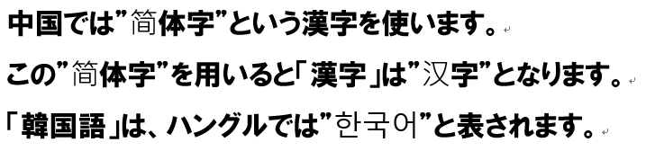
Because Japanese and Chinese characters are slightly different, but Unicode decided to unify them under the same codes....
I remember that PES6 was the only PES to get Polish translation. The start screen wouldn't render correctly because the font was missing the glyph Ś.
Alternately, imagine if all text in your favorite game was IP owned by some random third party that could ruin everything one or two years down the line.
Perhaps it is time for more people to invest in royalty free IP? We are seeing a bit of a tragedy of the commons type of situation going down, right now.
Sounds like one should be able to get a long way if you put down, say, 2 years of the new license fee and then never have to pay again
I guess the trouble is that game companies can't really band together and pool money to make a good font since the point is to look unique, so this only works for the largest studios. Otoh, at least for now, the smaller ones might stay below the 25k user limit
The license before was attractive before. I guess they will be switching. Maybe also to free fonts. From the article: >UI/UX designer Yamanaka stressed that this would be particularly problematic for live service games; even if studios moved quickly and switched to fonts available through an alternate licensee, they will have to re-test, re-validate, and re-QA check content already live and in active use.
It is that existing annually paid licences are converted. The extra work for existing titles is the problem. And:
> The crisis could even eventually force some Japanese studios to rebrand entirely if their corporate identity is tied to a commercial font they can no longer afford to license.
Yep: https://en.wikipedia.org/wiki/Monotype_Imaging#Consolidation...
Fontworks’ team, type inventory, IP, technology, and services will join global type specialist Monotype–Monotype’s first acquisition in Japan.
Additional anecdote about Monotype pricing policies:
https://old.reddit.com/r/graphic_design/comments/1jqqlm6/mon...
>whoa there, pardner!
>Your request has been blocked due to a network policy.
>Try logging in or creating an account here to get back to browsing.
>If you're running a script or application, please register or sign in with your developer credentials here. Additionally make sure your User-Agent is not empty and is something unique and descriptive and try again. if you're supplying an alternate User-Agent string, try changing back to default as that can sometimes result in a block.
>You can read Reddit's Terms of Service here.
>If you think that we've incorrectly blocked you or you would like to discuss easier ways to get the data you want, please file a ticket here.
>When contacting us, please include your Reddit account along with the following code:
Reddit is weird these days. I'm not even sure how this is related to fonts.
Interested in tangent replies to this, even if such fonts are artistically unsuitable for games - are open source fonts OK for Japanese? I understand that Unicode denotes single characters for both Chinese and Japanese (and Korean outside of Hangul?) even though there are differences between how nations write these 'single' characters, so the result is a Unicode font will look like a Chinese font, or a Japanese font, but not both.
How do the big Unicode OSS fonts like Noto, Deja Vu deal with this?
IMO: quality wise, FOSS fonts are fine(n=1) - it doesn't have to be a proprietary font but do have to be the right ones of CJK.
- In cases with the Noto project, they've given up long ago on literal singular font in both name and file to cover every languages; they have bunch of variants as different fonts(TC,SC,HK,JP,KR,...), available as both individual files as well as combined files[1].
- In cases with most Latin fonts like Deja Vu - I think this is where bulk of "wrong font" problem comes from. They don't support CJK at all, and operating systems often handle fallback to system defaults for missing characters, but sometimes OS falls back into wrong CJK fonts and cause text mIshmashlnG[2] problems or show bunch of square placeholders(aka tofu). The latter is usually solved by installing Noto fonts, and former by specifying what fonts are to be used for fallbacks(anyhow it's done, it can be OS or game engine dependent).
- There are also bunch of domestically made fonts such as IPA Gothic; they usually only support the targeted one of CJK + ASCII(+ISO-8859-1). Most Japanese-English _bi_ lingual contents take this route, which had lead to curiosity by some as to why Japanese content creators appear to have unique and specific taste for fonts[3] - in fact they're just reusing the font files already in the project folder.
- For creative purposes such as games, FOSS fonts sometimes don't cut it, but that is not unique to the Japanese language.
1: https://cdn-ak.f.st-hatena.com/images/fotolife/s/satob/20231... | https://archive.is/6qeVm
2: https://blog.enjo.life/wp-content/uploads/2022/08/fonts-and-... | https://archive.is/jSQzn
Every variant is a different font. IMO Han unification is one of the greatest failures of Unicode.
> There's no Noto Serif for CJK characters
Yes there is: https://fonts.google.com/noto/specimen/Noto+Serif+JP
> I understand that Unicode denotes single characters for both Chinese and Japanese (and Korean outside of Hangul?) even though there are differences between how nations write these 'single' characters, so the result is a Unicode font will look like a Chinese font, or a Japanese font, but not both.
This is "Han Unification", a terrible idea from early in the development of Unicode. The idea was so bad that the affected glyphs are now also given always-Chinese and always-Japanese Unicode points, making it possible to, for example, compare a Chinese character to a Japanese character in the same document.
But the fix exists. You can specify that you have no idea what you're trying to write by coding it as U+76F4 (直). Or you can specify a Chinese character by coding U+FAA8 (直). Or you can specify a Japanese one by coding U+2F940 (直). There isn't actually a reason you'd want U+76F4 - it's just a dead, useless unicode point - but we can observe here that my default font doesn't include a glyph for either U+FAA8 or U+2F940 even though U+FAA8 is by definition identical to U+76FA (since this is a Chinese font).
You can't just "swap a font out" without redoing all the work.
Type layout in Japanese in particular has a system of layered, complex rules that include rules that define how to combine Western glyphs with Japanese glyphs and produce visually harmonic work. Swapping a font out due to a cost issue is not workable.
Also, not all pan-asian fonts contain all the glyphs you need to render all the characters you want. A CJK font has tens of thousands of characters, and it wouldn't surprise me if some of these video games will use fonts with particular glyphs that are not always included in other fonts.
Monotype is giving these customers the finger while also ramming a bulldozer in their asses with this change. It's completely unacceptable, painfully rude, and ridiculously tone deaf. In fairness, this is totally on brand for Monotype.
Even in Minecraft it looks bad. Some CJK characters are Serif for some reason.
unifont has cjk support, bitmap fonts work just fine for the integer domain. been using unifont system and app wide for some integer number of years now. i believe the only app that i use that does not have unifont is the game rimworld, but i haven't investigated to see if there's any fix for that. for qt based apps i believe you have to use the environmental variable QT_FONT_DPI=128 or something similar, where the 128 is double the DPI, which may be some bug that i got around that may be fixed now
I know Noto Sans can render just about everything, and has a permissive license:
I am not sure if it's possible to parameterize it to have the look that game developers wanted.
A font like Noto Sans which is cold and nice for a text document isn't quite what game developers are looking for. A good font is one aspect of building atmosphere in a game, and a sterile font is detrimental to that.
So Monotype is going to make some more money in the short term, then when customers eventually find replacements they lose the revenue.
Sounds like a typical private equity endeavor with short term thinking.
This is something that happens currently all over the world. Yet another company thinks they can get away with steep price increase at the end of the year. People must understand that economy must be ecological. If you behave like a cancer and kill your host, you won't live forever
-- edit --
I'd add that companies always strive for more income. This is dead end. You cannot earn more without creating more. "Just add ai and convert to subscription" - this is current model. But, as Chris Rea sung, this ain't no technological breakdown, oh no, this is the road to hell
I'm looking forward to seeing everyone coming up together, creating better fonts for free, and wiping out any of those profits. Is Monotype trying to destroy their own industry, or do they really think this will work?
Fonts are an absolute joke. Foundries must be run by the mafia at this point.
Creating new (really good looking) fonts must be brutal
Many symbols are collections of other symbols raised and placed more or less on a grid. You could cover quite a lot with not that many created glyphs. Now, actually making it good quality and properly adjusted... that could take years...
1. Because fonts are works of art and any artist deserves to be paid. 2. Because there may not be a freely licensed font with the right aesthetics 3. Especially because Japanese fonts require much more work than Latn fonts, with not some hundred glyphs (a-zA-Z0-9 and punctuation), but with thousands upon thousands of glyphs
Isn’t it then fair that a company charges 20k instead of 400? Since it’s so much more work.
It’s wonderful to see capitalism work so well. First you sell cheap to create vendor lock-in and undercut your competition.
Then once you have a monopoly, you hike up the price. Until a government authority comes along and introduces state sponsored competition or declares you “too big to fail”.
Rinse and repeat.
EDIT:
Being downvoted for stating the obvious is fairly typical for HN.
Too many folks here have a mental disconnect between their earnings (stocks in large for-profit tech companies) and complaining when their favourite game maker has to fork out more money to supply the profit for said large tech company.
You can't have it both ways. You can't pretend it's unfair when smaller, non-greedy companies get squeezed out by behemoth companies that are forced to increase their earnings, else their stock owners will complain and the share value will drop.
If you're going to downvote my comment, then please also point out where my thinking is off. All I did was describe how capitalism works and the consequences thereof.
I don't think that's practical, because the subset would still be quite large. I did a quick analysis of the Factorio localiization files and found more than 1200 unique characters
The bigger issue here isn't the pricing, it's the 25,000 max users added to the licenses, which means that anyone who can genuinely afford these fonts isn't actually allowed to use them.
Edit: This paragraph was incorrect:
    The fonts affected apparently include ones like the main Japanese language
    font used by the game Genshin Impact, which has 2.8 million daily users
    worldwide (no idea of the Japanese user count specifically, but I'm sure
    it's over 25,000).
Genshin's UI font is produced by Hanyi, not Monotype.
https://www.hanyi.com.cn/adminlte/ueditor/image/20230906/169...
> Monotype will have a much harder time trying to strongarm a PRC-based company if they decide to try this there
Monotype has a Chinese subsidiary [0] which has worked with Chinese champions like Tencent [1] and Alibaba [2].
As long as a foreign vs Chinese business dispute doesn't involve a national champion or a very politically connected Chinese firm (or the foreign company made a partnership with a politically connected partner) the dispute is somewhat fair.
While China's leadership is trying to build self-sufficiency, it is also still trying to attract foreign companies to China and prevent an FDI outflow [3], and that requires some level of impartiality in contract disputes. China is not as economically isolated as Russia is today - though even Russian authorities tend to only use the heavy hammer against American and European companies as can be seen with the continued operation of Japanese, Korean, Taiwanese, Vietnamese, and Indian firms in Russia despite the risk of sanctions.
[0] - https://cn.monotype-asia.com/contact-us
[1] - https://www.monotype.com/resources/case-studies/tencent-expa...
[2] - https://www.monotype.com/resources/case-studies/alibaba-grou...
[3] - https://www.gov.cn/zhengce/zhengceku/202507/content_7032625....
What do I feel like custom font generation is one thing AI could be really good at but so far I haven’t seen anything of that sort? Seems like you could easily prompt whatever vibe you’re looking for in a font, why even bother buying commercial fonts at that point. Am I just not looking in the right places?
Creating a CJK font seems exactly the kind of thing they're still bad at, and the results I got from just trying it on Gemini, ChatGPT, and DeepSeek pretty much confirmed that. This is like the whole "draw a clock" challenge except there are 2000+ common clocks and a bajillion more obscure ones, and regional differences like the grass radical[1]. You'd probably need to start from teaching it the principles like radicals, stroke weight, etc. as if it were a human calligrapher.
> What do I feel like custom font generation is one thing AI could be really good at
Probably because you're wrong. Anybody can make a font, making a good font is a highly under appreciated art form.
Fonts are not generated as bitmaps, anyone who doesn't see how AI can and will be good at font generation is a fool.
It wasn't long ago that we thought creativity and programming were safe from AI. Fonts are entirely within the realm of possibilities within 12 months.
What a bereft way to produce beauty. "This grey slop is good enough, isn't it?" Christ, people, let's be human again.
AI fonts are nothing new. But you still need someone to manually check them and it's never one-shot. It makes no economical sense to do that instead of buying commercial fonts, which are ready-to-use immediately, when they only cost a few hundred dollars.
The price rising and licensing issue will only do one thing: pushing people to AI. Perhaps they see it as inevitable so they're trying to milk the last batch of customers though.
perhaps when the clocks at https://clocks.brianmoore.com/ consistently make sense, AI could make a font.
Even then, I wouldn't want it making a kanji font. Consider 感 and 惑, both of which would be taught before high school.
Sounds like you don't know the CJK font market. AI assisted font design is nothing new and especially useful for CJK since there are so many glyphs. There are plenty of foundries openly advertising AI-assisted fonts, e.g. https://izihun.com/fontxiazai/ziti-2673.html
Also, generating images and programs are basically orthogonal. AI could generate impeccable photorealistic images of clocks years ago, and they're much more complex than font glyphs (specifically talking about transferring a style to other glyphs; you still need to do the initial design to get something appealing, obviously*).
*Edit: Maybe AI can even handle the initial design now, not sure. What I’m saying is AI-assisted style transfer in CJK fonts is definitely old news and commercially available.
Those fonts look awful in a hard to describe way. Font uncanny-valley? I feel like a barcode reader trying to OCR meaning out of ink blots.
Those fonts are completely indistinguishable from the average cartoon/artistic font from the 2000s which are definitely not created by AI. I don’t like most of them, but I don’t like most of the human-designed ones either. Plus AI-assisted fonts in CJK often means hand drawing a couple hundred characters, maybe more, then generating the thousands of remaining characters (I assume the current crop of SOTA models could change that, but these fonts have been going around for a while), so the odds are what you see in the samples are mainly or maybe even completely human-generated.
Wow, K2 is killing it on this for me. Three minutes have been 100% correct now.
Haiku 3.5 had a one right too. But k2 apparently is very good at html and css.
A few hours ago, [0]
Perhaps an old-school bitmap font would be within the realm of possibility, but I wouldn't be confident of GenAI's ability to go from sprite sheet to proper TTF with glyphs described as curve/points without a LOT of manual work - and especially not when we're talking about a language with complicated logographs.
As I understand it you can't protect the appearance of a font so imperceptible differences can be made on a copy unless you do a design patent which only lasts 15 years and isn't always done. (In the US)
It would be pretty easy to make a font generator using LLMs and visual models.
Ah Monotype. Knew before reading the article it would be them. Their whole MO is buying up smaller type foundries, massively increasing the licensing fees and shaking down the previous customers. They send in auditors, demand to see traffic data and threaten fines. Happened to me twice now.
Creating type is an extremely difficult and skilled discipline and designers deserve to be compensated fairly. However Monotype’s business practices are such that I won’t approve anything but open source fonts for new projects.