Comment by Lammy
Comment by Lammy 2 days ago
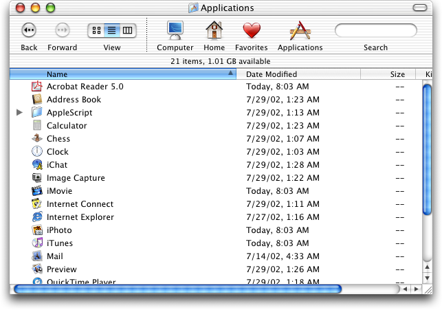
Compare to Aqua and Platinum where every resizable window/pane had a big square drag target clearly labeled as such with some diagonal lines:
https://guidebookgallery.org/pics/gui/system/managers/filema...
https://guidebookgallery.org/pics/gui/system/managers/filema...
It also - as seen in that screenshot, had large, always visible scrollbars where it was easy to see how far down you were in a folder or document, and could easily click and drag to scroll to where you needed. Now in the service of minimalism we have scrollbars that consist of a thin, semi-transparent line that fades out after half a second and is nearly impossible to click and drag due to how small it is.