Comment by uncircle
> It utilizes different shades of grey borders to convey a sort of faux surface-normal highlight on beveled edges to indicate whether the element is raised or sunken.
You mean this? https://feedback.minecraft.net/hc/user_images/01HQQV8HYE6GKB...
That's the Windows 9x style ported to a low resolution UI, probably with some shaders because computers today are fancier than 1995. It's not interesting innovation, though I agree it's much better (and feels better) than the flat UI boring aesthetic.
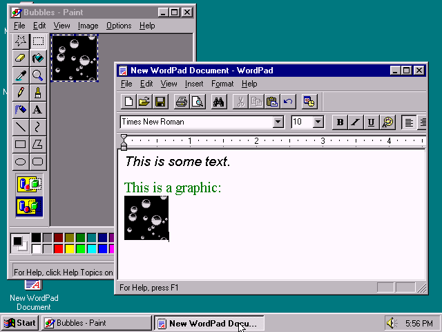
Behold the peak of desktop UIs: https://blogs.ubc.ca/nancyhuang/files/2015/10/Windows95.png
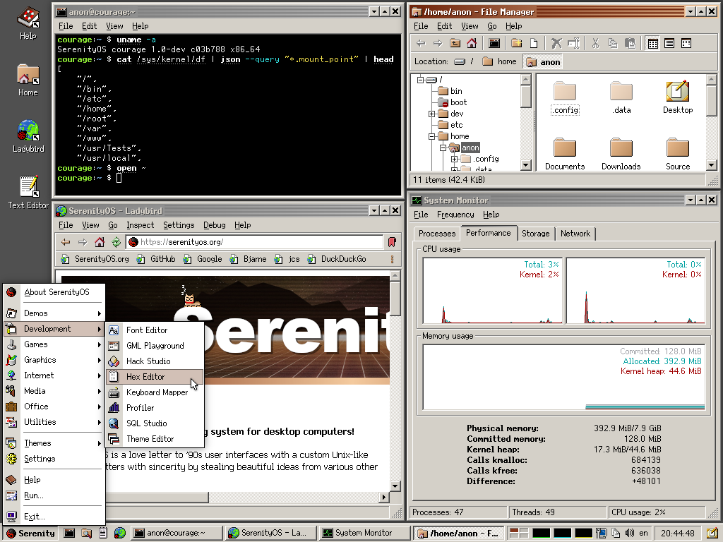
See also SerenityOS with an Office 2000 look which added some flatter UI concepts, yet it still is tastefully tactile and three-dimensional: https://raw.githubusercontent.com/SerenityOS/serenity/refs/h...
Important to highlight that Minecraft on consoles, Windows 10/11 and mobile have a different UI.
https://minecraft.wiki/images/thumb/Ore_UI_Design_System.png...
https://minecraft.wiki/images/New_UI_-_Achievements_Screen_M...